Part of the challenge with creating a sample newsletter for you to base your e-newsletters on is there are so many different designs and templates available that your choices can be mind-boggling.
However, that’s your challenge. How do you find an email newsletter template that can showcase your awesome brand?
The good news is you don’t have to. If you’re spending tons of time on fancy unique designs for your newsletters, you’re focused on the wrong thing!
I’ll share with you here two e-newletter layouts and a check list so you have some guidelines based on what we’ve tested again and again after running over 2,400 campaigns in the past 6 years.
I’ll start with our own newsletter as an example (simply because it’s easy to get my hands on) and then share another sample newsletter from LinkedIn.
Here’s a screen shot of the last ZinMarketing e-newsletter
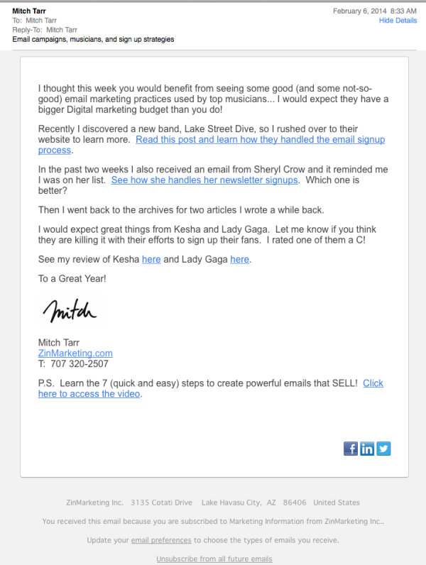
E-Newsletter Checklist
1. It’s a one column design. There’s been enough testing done to demonstrate that 2 or 3 column designs look nice but aren’t as effective for readership and clicks. If the content is good the reader is reading the main body and they ignore the clickable items in the right column. People read top to bottom. Make it easy for them.
2. It’s short. Long email newsletters tend to get set aside to be read later… which they never are.
3. The design is simple. In this case there is no header in the message. In our case we’ll sometimes add our logo top left as a header to showcase our brand. It’s not necessary to create a masterful header with logos, tag lines, social media logos, and an edition number. People really don’t care. If your content is good, they’ll start reading it.
4. It’s personal. In this case the newsletter is from Mitch Tarr so it’s designed to speak to the reader. Many great newsletters use a personal greeting from the CEO or President to showcase what’s in the newsletter.
5. It delivers the content on the blog. It’s becoming a good practice to show a short intro to a longer blog post and link to your site. You’ll get good data on which topics get the most clicks and you’ll put your reader back on your site.
6. It uses a P.S. The postscript is a well-tested, proven way to get a reader’s attention. Here we inserted a soft promotion link right at the end of the newsletter using the P.S.
7. It has social media links at the bottom.
8. It has a street mailing address and an unsubscribe link at the very bottom. These are required for CAN-SPAM compliance and it’s almost impossible to send an email without the ESP inserting these for you.
Now take the check list and review this e-newsletter from LinkedIn
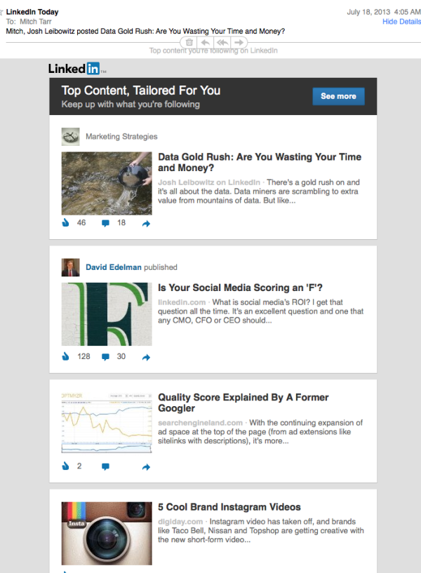
Notes:
1. You can see they’ve branded their newsletter with their logo at the top… and it’s small!
2. They’ve broken each story into a block. It looks nice AND they are using a single column, simple layout.
3. They are using a headline on each story to get your attention. They write great copy trying to move you from the newsletter to the site.
3. They are showcasing the author to draw you in as well.
4. Their social media buttons show you how popular in likes and comments these posts are. That social proof will steer you towards the most popular articles.
5. You can’t see it, but they do have street address and unsubscribe info at the bottom.
6. You can’t see it, but they have 6 stories in this email. That is about the most I would publish in order to keep it short.
You see, in today’s advertising-crazy, complex media world simple is better.
Just look at any design by Apple!