I discovered a new band recently, Lake Street Dive. They are FANTASTIC!
So like any new fan I cruised over to their website to see what I could see. And of course, I immediately looked for an email sign up form. Once I got through the registration process I thought other musicians might appreciate a few pointers on how to use email to it’s fullest.
First stop — the home page
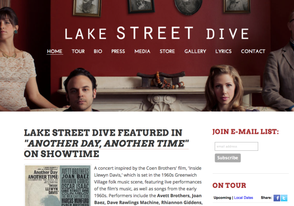
So far, so good. I see a Join E-Mail List: optin form on the top right of the page. Nice and clean. Only asking for email address. Also good. If I was doing this I would add a reason to join. “Get inside stories from the band” or “Get the latest news only for subscribers of upcoming events” And of course I would replace the ‘Subscribe’ button with a ‘Sign Me Up!’ button.
For what it’s worth this is a well-designed site. Nice and clean, easy to navigate and has the things you expect from a band site. Well done.
Yet they neglected to add a Join E-Mail List: option on EVERY page. Make it easy for your visitors to sign up when the mood strikes them.
Also, it would help to have a dedicated page on the NAV bar called Join E-Mail List. They are short of space but you really get more subscribers when you go the distance.
Next Stop — The Thank You Page
This is the page you are redirected to immediately after subscribing.
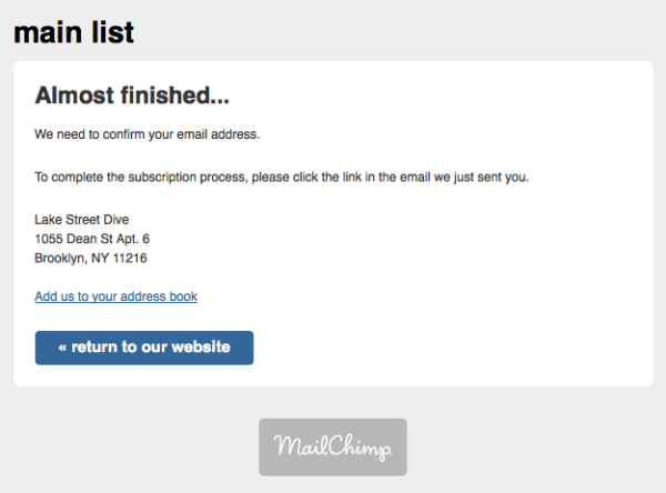
This is a big miss! This page is a generic MailChimp mailing page. I would do two things different.
First, I would write some copy that says more about the process and once again remind people why they should confirm their email address. Offer an incentive to get them to take that last step.
The double optin is a good thing. It ensures a higher quality of list. It also reflects the intent of the subscriber. They are less likely to complain if they took the extra effort to confirm their email address. But that doesn’t mean they don’t need a little nudge to get to the next step.
Second, and more importantly, I would use a custom page that is part of the website. With the design, navigation, and all. Much more professional and if you felt like doing a little marketing you could offer a small coupon on merchandise or CD sales right there.
Let’s look at the confirmation message itself.
Here’s what I see in my inbox within about 60 seconds.
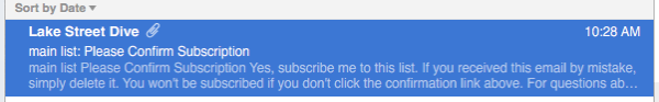
Again, they’re using off-the-shelf content from the emailing software. At a minimum they should go for personality and change the name of the main list to something more reader friendly — how about special fan list or backstage pass newsletter. Easy to do and makes this message more friendly.
What happens after you click on the ‘Yes, subscribe me to this list’button.
You get taken to this page.
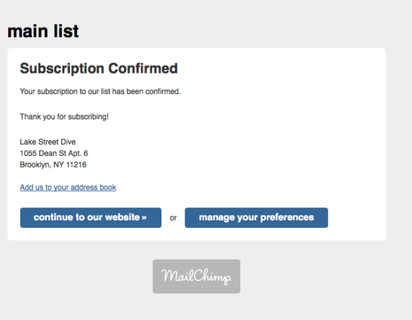
Another miss! This should also be a dedicated landing page using the site’s full design.
Review the optin sequence.
Now run back through these steps and see how these changes would make the visitor experience WAAAAAY better. Compare how things feel with the off-the-shelf messages with minimal customization and the full integration of the email process with custom, personal messages AND if you want, an offer to entice new newsletter subscribers to pull out their wallet.
I’ll wait a while to see what I actually get sent by the band to see if they well and truly embrace email as a fan base development tool.