One of my clients from a few years ago has been continuing to work on their email newsletter and I think today it is one of the BEST examples out there of how to do a newsletter… especially if one of the reasons you do a newsletter is to sell product.
Let’s jump right into it. I’ll show you first their newsletter and then their matching promotional message and go through it point by point to show you why it is great.
I should mention that many of the email newsletter pointers you’ll see here have been tested over the years so we know they get results.
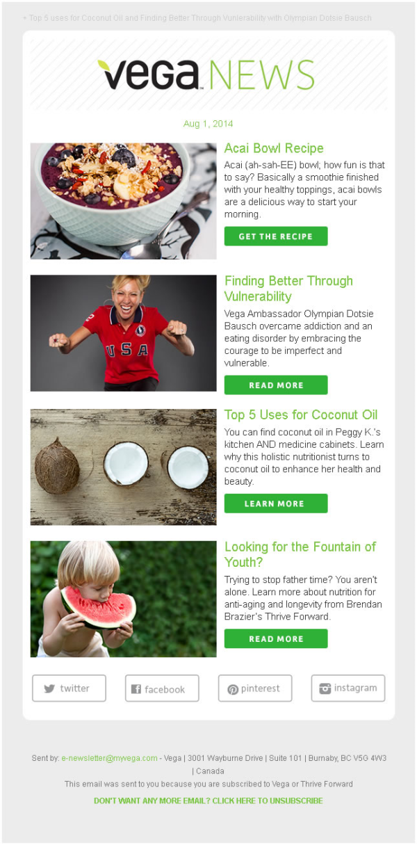
Here’s the newsletter:

Best Practices
1. One column
2. White background
3. Copy is short and leads to content on website
4. Images are well chosen and all the same size
5. Only 4 stories
6. Call to action buttons are very visible
7. Lead text shows properly in preview pane
8. No distracting messages (the small print)
9. Simple, narrow branding banner
10. No unnecessary volume numbers or series
11. Clean simple social buttons at the bottom
12. The sent by email address in the footer complies with the new Canadian anti-spam laws
It seems simple to do but you won’t have to look far to see newsletters that break these best practices all day long. The worst part is the reason they go against the best practices is that someone on the team has an opinion about design. Unless you’ve tested one style vs another you’re really just guessing. My advice… try some of these techniques and see if your results don’t improve.
Now for the big piece of advice. (This is one of the most valuable, effective, simple strategies that works with our clients… so pay close attention.)
You’ll notice there are no sales pitches in this newsletter. There is a recipe and other stories related to the product but no “offer”. Most everyone thinks if they put an offer in their newsletter “some people will click on it some time and they’ll make sales”. It doesn’t work that way. When you put a pitch in the middle of the news, it tends to be treated just like another piece of news.
When you separate the pitch to it’s own separate email you get much better results.
Before you say it, no, people won’t mind getting a second email from you. No, they don’t notice that it’s an offer. No, you’re unsubscribe rate will not skyrocket.
What will happen is your readers will read your newsletters and say “Thanks”, then they will see your promotional email and deal with it.
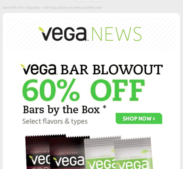
Here’s how the promotional email looked in my inbox.

We know who it’s from. Look in the subject line and see the offer and call to action in the same short text. Very good! Then look a the text displayed in the preview pane. That’s designed to further induce you go go to the promotional message which looks like this:

Some best practices for this matching promo offer.
1. It’s headline based.
2. It uses the same familiar banner from the newsletter.
3. The early text in the message shows properly in your preview pane.
4. The offer is clear and there is a big bold call to action button.
5. Then, and only then, are images used to support the email message. Not the other way around.
This is a bit longer blog post but I thought you would benefit from seeing this full strategy from one of the best mailers I know.
Recap.
1. Keep the newsletter clean, simple, and relevant
2. Make the promotion short, compelling, and headline based.
3. Separate the promotion from the newsletter.
I had a client not too long ago that simply separated their promotion from the newsletter and increased revenue 278% in about 90 days!
Try it.
