INTRODUCTION:
Our ZinMarketing Email Marketing Reviews are written so you can see a real live example of how a certain company is using email marketing and by example to show you how you improve.
Up today, the Bonacquisti Wine Company in Denver. Billed as ‘Denver’s Urban Winery’, word on the street is they have a very active live music scene on Friday evenings. You can check out their Friday’s Uncorked on their website.
Naturally, the first thing I do when I head to site is to look for a reason and a place to join a list. As a visitor, I might want to keep in touch for the time being. As the owner of the website, I know that a large percentage of my web visitors will pass through, never to be seen again. They may not see something that catches their attention now, but if they were on my list they might see something in the future… IF they were on my list.
TIPS:
After I take some time and look around, I do find a place to join the list:
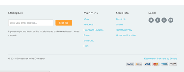
Where do I find it? It is buried way at the bottom of the page. The good news is, you can find this form on the bottom of EVERY page in the site. That’s a good best practice. So many companies only place their form in one place.
Tip 1: Where to place your Optin form
You’ve heard us talk about this before in other blog posts but the best way to maximize the number of subscribers to your list is to do the following.
– Place an optin form on every page in your site.
– Create a dedicated sign up page and place it in your Web Navigation Menus
– Place your optin form in the best real estate you have. Above the fold. Top right or top left of your home page. If you’re a company like Groupon, your home page IS the signup form.
– Make sure you use a pop-up, or a slider, or some other moving offer to catch readers attention. (We’ve written about this before. You might hate them but they work!)
Tip 2: Tell people why they should join
In many, many cases marketers don’t even take the time to write an appeal that might motivate a visitor to join. In this case there is a what I would call a ‘sign up statement’. It’s right under the box.
What would work better is to take advantage of the real estate you do have. The header ‘Mailing List’ above the form could be the pitch… “Sign up for our VIP List” “Join our Insider’s Club”
Then you can write a benefit statement under the form that’s more compelling. It’s a good practice their button is colored and says “Sign Up” instead of the flat “Submit” button. What does your signup button say?
Tip 3: Use a customized Thank You page
Here’s the page I see when I hit the Sign Up button.
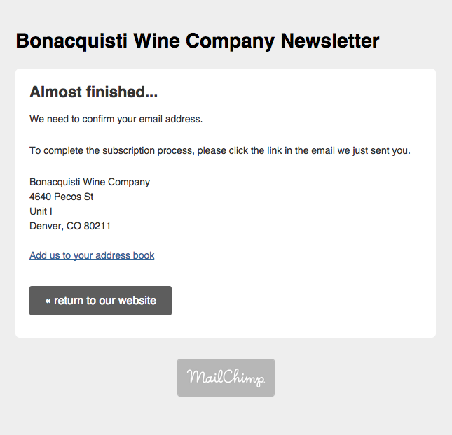
This is good and bad. The good part is the reader is told exactly what to expect and what to do next. One thing not mentioned is if you used an email like info@ or contact@ or admin@ or some other general inbox you might not get the message. You can see they are using MailChimp for their mailings but many companies like MailChimp these days will not send to an info@ email address as a matter of policy. They are trying to reduce spam complaints.
The bigger challenge here is this page is is a standard off the shelf MailChimp Thank You page. This is the time to start building your relationship with your readers. Start by sending them to a dedicated Thank You page that has some of these things on it. Go crazy, this is still the start of your courting period.
Tell people what to expect next.
Add a welcome video from the owner or winemaker.
Add a note to explain what your winery is all about.
Tell a story about the Uncorked Friday events.
Offer a coupon the subscriber can use on their first order or in the tasting room first visit. They can collect their coupon when they confirm their email address. That will increase conversions.
And by setting a custom Thank You page you won’t be advertising for MailChimp.
Tip 4: Test your sign up process (continually)
We’ve seen this happen more times than we like. It makes us uncomfortable. We understand there are lots of things that need to be attended to that keeps a website up and running these days.
When we click on the “<< return to our website” button on the Thank You page. When I did that, I was presented with this:
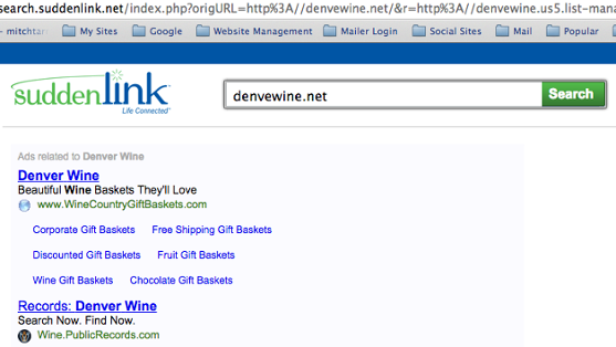
You’ll notice the “<< return to our website” link was supposed to send me to their website,www.denverwine.net but the typo sends me to this jarring page. Takes the fun right out of trying to get information, join a list, or ordering some wine!
Always go back and check your process with a fresh email address to make sure it still works!!!!!
CONCLUSION:
There are a lot of moving parts that go into making an email marketing process work well. We only looked at the very tip of the signup process. The same insight and experience that goes into being able to improve this step can also be applied to other aspects of email marketing to improve, open rates, clickthrough rates, and email related sales.
We know. We’ve learned after sending 2,400 different email campaigns over the past 6 years.