I’m a big fan of red wine, Pinot Noir in particular. So it’s no surprise I’d be interested in related info. Even though I am on over 647 wine-related email lists, this one caught my attention…
…for a second.
I’ll show you the email in a second but the mistake is more common than you realize, especiallly if you like to use fancy formatting.
Here’s what I saw when I opened the message.
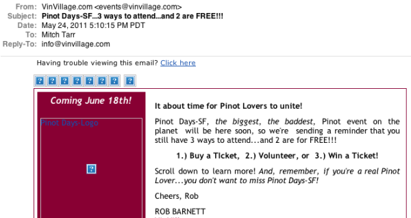
The mistake is the reliance on images to make this email work.
Many of your readers have image blocking on so they won’t see all the fancy graphics you intend them to see. That means the copy has to do the work with a handicap.
Many people will look at an email newsletter to see if it’s of interest to them. I had to get past all the distracting ‘non-images’ in order to read the message. Way faster to do that then to stop, turn on images, THEN read the email to see if it’s relevant.
So take your newsletter and send it to an email address where you can see what it looks like without the formatting. If your message isn’t clear or is hard to read…
…your email message could be having the opposite effect you intend it to.