Sometimes I find an example of email marketing best practices that is just too good to pass up sharing. I was reading in the NHL off season to get my hockey fix, and I came across this website: http://thehockeywriters.com/
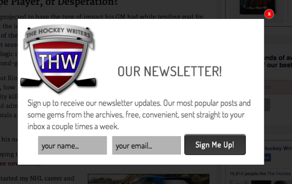
Aside from it’s great layout (and content of course), I noticed something. This simple popup showed up a few seconds after I landed on the page. I was easy to ready, easy to understand the offer, and easy to get rid of. That’s perfect for a popup.
As always, I’d suggest testing load times. I’ve seen the difference in conversion times vary a lot between a 10 second and 90 second load time. I’ve also noticed it varies by audience. There is no magic number here. Make sure you test.
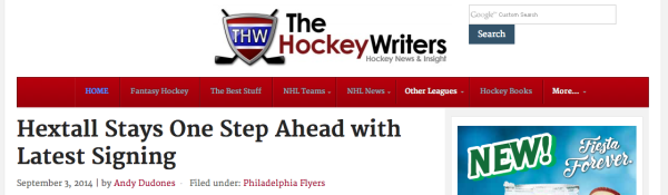
Just so you know what I’m talking about this is the website header. They have a search bar at the top but they could just as easily have placed a newsletter signup form there.
They could also have placed a navigation bar item to the Newsletter page. They’re short on space so it may have taken lower priority.
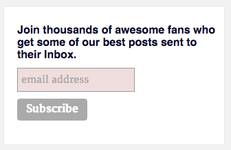
Then I notice something else. On the right hand column of many of their pages, I see another opportunity for you to join the list. This one is pretty good. One thing though, try to make all your offers the SAME if in fact the reader lands on the same newsletter list. If they are worded differently or have different offers, you run the risk of confusing your reader and they might not take action right then. They like to be sure what’s what.
AND I notice something else. This is a great practice. Right in the middle of the article copy is another opportunity to get you to join up in the form of a simple offer. A simple text offer that fits right in to the copy… and that’s why it works.

After seeing all these great practices, I have to sign up and see what happens. Could it be too good to be true? Will the email signup process be a hat trick?
Here’s the Welcome Message. (See if you can spot the problem)
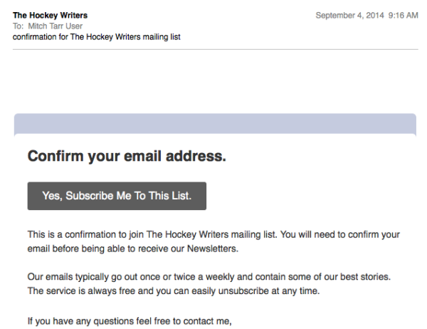
Full marks for using a Welcome Message the goes out immediately and one that has been modified to tell you, the reader, exactly what’s going on and what to do next.
The missing link…
This is a standard, off-the-shelf, vanilla, ESP template message. That’s an icing call!
This is your chance to make your first and best impression. Show your stuff. Make the quality and the look match your site. Great content, great layout and then you get this template email. It doesn’t even have a logo in it.
You’ve head me urge in other posts to use this message wisely. Start building your relationship here.
Overall, I was impressed with thehockeywriters.com use of email signup best practices. Then, I was disappointed when the Welcome Message came out.
Go review your own signup process and see if you are doing a good job. Remember, it’s your chance to make a strong first impression. Don’t blow it.