You all know those annoying popups. You’re on a site minding your own business and suddenly a window is blocking your view!
Just so we’re all on the same page. It doesn’t matter that you like or dislike email popups, what matters is that if you use them properly, your sign up rate for new subscribers will soar.
Here are three examples of email popups that are well executed and warrant a closer look.
Popup on the side
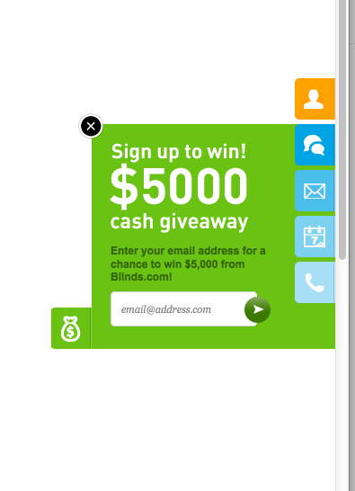 Let’s take a closer look at this example. You can tell the site is Blinds.com and they are interested in scooping up your email address. This popup option is less intrusive. It doen’t jump out at you and just sits quietly to the side and makes a clear offer to trade your email address in exchange for a chance to win.
It’s a good execution of an email offer that goes above and beyond just a form on the page.
Popup with ethical bribe
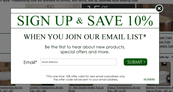
Here’s an example of a popup which is targeted specifically to buyers. A 10% coupon is the ethical bribe to get a visitor to sign up. This is a good example of a simple offer. The headline says it all. For these types of popups make sure the offer is simple and easy to explain.
Of course the more compelling the better.
Popup with mandatory enrollment
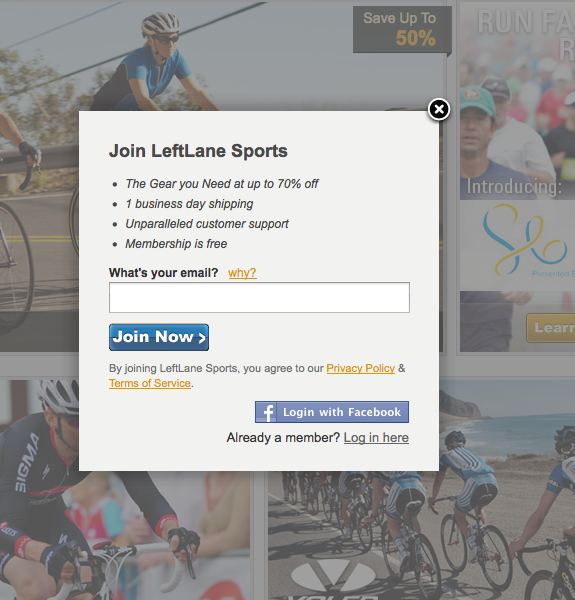
This is an interesting popup. In order to actually get to the site you MUST give up your email address. When you click on the why? link it explains that as a member-driven site they have to know who you are in order to let you participate in their offers.
It’s a solid ‘reason why’ that makes sense. That’s an important aspect of a ‘reason why’… it has to make sense. If you don’t believe it, they likely won’t either.
Think again about using email popups on your site. They really don’t do any harm to your brand and they can increase your conversion of visitor to subscriber dramatically.