INTRODUCTION:
Email marketing reviews are designed to showcase email best practices by way of showing an example of email marketing from a real company. We don’t know the company or anyone who works there. Gigya.com was selected as a potential candidate in our traditional way.
![]() We visit their site and pretend we are in their target audience and start looking for how email is being used to support their business. We can’t see behind the curtain what’s going on, but we can always learn from the outside looking in and show examples of things you can do in your email campaigns that will help you get better results.
We visit their site and pretend we are in their target audience and start looking for how email is being used to support their business. We can’t see behind the curtain what’s going on, but we can always learn from the outside looking in and show examples of things you can do in your email campaigns that will help you get better results.
Let’s take a look.
Email Marketing Review for gigya.com
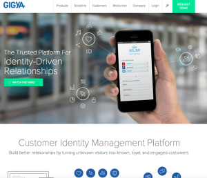
We’re going to focus in on only two things today that you can learn from and adapt to your business. Naturally we start at their home page. Great page. Good layout. Clean, professional, all that good stuff. When we search for an optin form however, we can’t find one.
The only call-to-action we can find on all pages is a link to “LEARN MORE”. The site is rife with LEARN MORE buttons. They are everywhere. The true value in a site designed like that is to find what people do when presented with choice. Which link do they click on? And what do they do next?
Valuable visitor and market research. Yet, to us one of the critical roles a website has is to generate new leads via building a responsive email list. There is so much more to marketing that just placing a REQUEST DEMO button on various pages.
1: Where is an optin form located on your site?
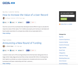
We’ll save you the trouble. The only page we could find a contact form was on the Contact Us page (as you would expect) and a GET OUR LATEST POSTS form on the top right of the blog posts. That is a good practice. You want an email collection method on every blog post.
BEST PRACTICE ALERT: Even better, you want a call-to-action INSIDE or at the end of every blog post also.
So the lesson here is to make sure you have an optin form all over your site. Not just on the run of the mill blog posts. Decide what your main offer will be, and plaster it everywhere. Then, track where your signups are coming from and you’ll be doing real marketing… learning what THEY want as demonstrated by their behavior.
2: The Optin Offer
Since this is the only place gigya is collecting an email address, let’s see if we can make it more effective.

Here’s the first place we would make some changes. Let’s start by reviewing our goal. We want names on the list. Why?
And more importantly. Who?
If you’re going to make an effort to collect email addresses, the effort should go into the offer. The offer here is to get posts. So far, not very inspiring.
What if these posts had a theme, or some value, or exclusivity, or insight you can’t get anywhere else, or information that could only be gained from insider reports… you get the ides.
Learn some copywriting skills so you can make compelling offers so your readers will say to themselves, “I’d be crazy to leave this site and not get on this list.” Once you have an offer that’s powerful, plaster it every where on the site.
3: Your First Impression – The Double Optin Process
You may have heard the terms ‘single optin’ and ‘double optin’ if you’ve been reading about email marketing. If it’s still a bit fuzzy the difference between the two, don’t worry. We’ll lay it out in plain English here with an example. This is how a double optin process works.
STEP 1: Your Thank You Page.
Here is the page I land on immediately after I fill in the form above. This is a good page because it tells you what to expect. It also gives you a link to add this sender to your address book which has the added benefit of ensuring most spam filters won’t grab your messages.
What’s missing here is any corporate branding. This is a plain garden variety code read… I mean Thank You page. Use a custom Thank You page and make it look like part of your website. This is part of you making a first impression.
And honestly, you don’t need to do any marketing for MailChimp. They’re doing just fine on their own.
STEP 2. The Confirmation Email.
The Thank You page gives you the heads-up to expect an email to confirm your subscription. Below is the email we received moments later. That’s important. Make sure your confirmation message gets out right away.
Again. garden variety Confirmation message. Brand it like your company so people connect this to you. You’d be surprised how many people fill in a form and forget your name within 60 seconds.
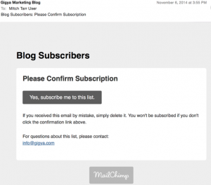
When you click on the link above “Yes, subscribe me to this list” you have just made this an official double optin. The action of clicking on a confirmation link makes it so. Simple.
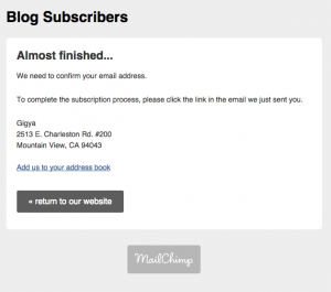
Then you are delivered to the page below. We call this the Confirmation Page.
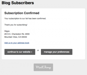
OK, stay with me on this. Someone fills in the form, checks their email, clicks on the link to confirm, and they end up here. 🙁 Sad face.
What about a celebration? How about another offer? How about something that looks like YOUR site. (Remember MailChimp is doing fine without you putting their logo in your new subscribers mind)
This page could be so much different. Here’s a thought. Explain in plain English the 5 reasons someone should request their FREE DEMO right now! After all, that’s the marketing goal that’s all over the website.
If a hundred people get on your list, a hundred of them will land on this page. Somebody has to request their demo, even if you don’t try to convince them why they should.
Overall, this process is done by the book. It’s just not very convincing or effective. Doing it this way is one reason you’ll hear people say “Email doesn’t really work for me”. No not the way you’re doing it.
Take a look at your optin process. Is it plain, garden variety, off the shelf, OR is it visually strong, compelling, interesting, and does it end in a great offer?
CONCLUSION:
We constantly are reminding our clients and prospects, this is your chance to make a first impression. You can make it go either way. Let me tell you the tale of two email marketers… one did it this way and one used the best practices we talked about today. After 1 year goes by, the difference between the two could be massive!