I’m such a fan of Apple computers right now. They seem to be getting things right and have been for a few years now.
Here’s an example of a simple and effective optin form. It isn’t fancy but it does exactly what a form is supposed to do. I’ll tell you what makes this work (and the one thing that they missed) once you take a look.
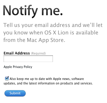
This is the landing page that you arrived on if you saw and clicked on this ad.

You can see that the ‘Sign up” link is done well. It is a different color to stand out and it has the right > to move you to the landing page.
When you land on the landing page you’ll see the ‘Notify me’ headline matches. It’s important that the landing page copy matches the ad copy.
The ‘Notify me’ copy is clear and they only ask for email address.
They could have asked for more and probably had internal debates to ask for Name and maybe other info but by keeping the request minimal, they increase their conversion rates.
You can see they have a privacy policy link right there–good practice, make sure you do too.
You can see they have the check box set as default ‘On’ when they ask you if you want to ‘keep up to date’ and get on their list. It’s a good method to grow your newsletter list.
The one miss–the lame ‘Submit’ button.
A better button woudl have been a “Notify Me” button or a “Sign Me Up” button or something of that nature.
These little things all add to up to email marketing success or email marketing mediocrity. Pay attention to the small details and you’ll get better results.