Last year I let my subscription to the Smithsonian Magazine lapse. Just got too busy to do the renewal and still haven’t done it.
They have my email address and from time to time I get a reminder message to renew. Sometimes these messages contain an incentive to motivate me to restart. Let’s take a look at the latest email and see if we can learn something.
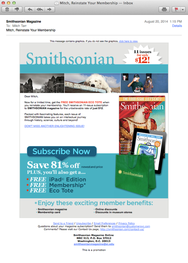
Here’s the last email I received.
Let’s go through this point by point.
1. “This message contains graphics” notice. The benefit to this sentence is to bypass the image blockers to readers can click on the link and see the email in a browser window. But the price is high. This sentence shows first in your preview pane as the first content of the message. In the preview pane it’s followed by the Dear Mitch copy. This sentence stops you from seeing the first part of the message and is a disincentive to reading it. My advice is to do away with it all together.
2. One key message or headline. One general rule of good copywriting to make one key offer and make it clearly. In the banner, they’ve inserted an “11 $ for 12 issues” message. Then they offer me a Free Tote. Then they mention 81% off. Finally, they tell me about “Member Benefits’ in a bottom banner.
This is an example of not having a single, simple, clear, compelling offer. The offer would be better if they had only ONE per email. The concept of the kitchen sink message reduces rather than increases the chances of a click.
Keep in mind, the goal of the email is to get me to the next step in the process. The next step should be to get me to a renewal landing page.
3. Overall design is also complicated. This message has a banner, three random images under the banner, a cover shot, a pic of the tote and a fancy subscribe now button. How many of those elements could you remove to clean up this message? It’s hard to design things that are simple and clean, but it’s worth it.
4. Call to action. They did a good job here. One call to action button that tells me what to do. They also have a text link in the body copy which is a best practice. It helps to have both a graphical and text call to action.
5. The copy is kinda like an afterthought. It’s a bit hard to see, it’s very short and all it really does is restate what’s in the design. It needs to be more interesting.
How about this?
+++++++++++++++++
Mitch,
Remember what it’s like to open the mailbox and get your new issue of Smithsonian? Vibrant stories about your favorite historical topics richly illustrated. How often did you sit down and read a new issue cover to cover?
We want you to feel that curiosity again when you get your next issue.
Renew your membership now and we’ll send you 11 issues for only $12.
It only takes a moment to renew and you’ll have the next 11 issues delivered direct to your mailbox.
Subscribe now >>
Sincerely,
John, Managing Director
Smithsonian Magazine.
P.S. If you subscribe in the next 48 hours we’ll also send you a Smithsonian Tote bag and the matching iPad editions. Renew your membership here >>
++++++++++++++++
See the difference?