I get questions about email design constantly. Often I’m asked to review an email newsletter design so I thought it would help to show an example of a great email newsletter. Now you can apply the concepts to your own design.
You’ve probably heard me say, you should apply 80% of your effort to your email copy, and 20% to your design… not the other way around; as so many people do.
You should also avoid the pitfalls of using an off-the-shelf template for your design.
I’m going to include a BIG image of a LinkedIn email newsletter below and then we’ll break it down for you so you don’t have to guess what works and what doesn’t work.
Here’s the LinkedIn newsletter:
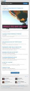
Here are your design highlights:
- You’ll see the LinkedIn logo on the top left of the message. That’s about all you should use as a banner. Use more and you are taking up valuable reading space.
- Right under the logo is a black navigation bar with the first call to action. “See More” It’s clear the goal of this message is to get you to the website to read on. That’s an excellent goal, and in terms of general strategy, allows you to then cookie your visitors so you can do remarketing or retargeting with Google Ads and Facebook Ads. This is an excellent way to develop your targeted lists.
- The next section of the email is a bit of a weak spot. Under the black nav bar is a Section “Highlight of the Day” and a headline AND a big image with another headline. This is confusing for two important reasons. It’s these critical early moments when a reader will decide to read your email or return to it later. If it isn’t crystal clear why they should read on, they may skip it.More importantly if you displayed this message on a mobile phone, you would see probably ONLY this big image and the conflicting headlines. I like to have the best, strongest, most compelling content right away so I can get my reader to stop working in their inbox and give my message some attention.
Never underestimate how important an iPhone test is to your newsletter success.
- You’ll see each section of the email newsletter has it’s own block. “Published by your Network” is followed by “Recommended for You”. This type of separation makes it easy to scroll through looking for something of interest.As a matter of principle, I probably wouldn’t use as many stories as they do. However, the design of a clickable headline, followed by a “Read more ” link, and the “See More at LinkedIn” button at the bottom are all good calls-to-action which move your reader from their inbox to your website.
That way you can see who clicked on which story and learn some market insight from the clicks. This is the same step we use to build a list of people who clicked on our links so we can stick with them to make further offers or engage them in the sales process.
- The next section is a great place to put faces to the names in your firm. For a recruiting agency in particular, this will give your company a personality and make you more attractive to deal with. At the same time, your recruiters would only be a click away.
- Finally the footer has the appropriate address and “Unsubscribe” links which look like they belong.
- You have choices as to where to include your social media buttons. If you want to include them at the top there is room. If you want to include them at the bottom add a section.
- Finally, you’ll note this is a single column design and probably looks great when read on a mobile device. Don’t miss the boat on this rapidly growing segment of your readership. Single columns will look the best on most mobile devices and pads.
Overall I’d rate this newsletter design an 8 of 10. My only comments are for that BIG image in the beginning and the length.
One strategy that would improve this email newsletter design would be to replace the big image with a short “why you should ready this and the benefits you’ll get of doing so” intro from the President or CEO. It makes the newsletter personal and will increase your readership.