INTRODUCTION:
Each week, we select a company and review their visible email marketing tactics. We never know what’s going on behind the scenes, but there are always lessons learned by looking in the window.
We don’t know this company and haven’t worked with them directly. However, just by observing the critical first steps a company uses in their approach to email we can help you see what best practices look like (when we see them) and areas to improve (when we see them).
This week we’re taking a look at loggly.com
The first thing we do when we examine a company to review their email marketing practices is to zoom to their homepage and take a look for signs of email marketing.
When we get to their home page we behave like an interested party and start to look around.
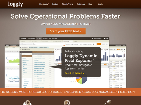
We see great design and so we behave like an interested party might, and start to poke around.
1: Compelling Copy is Important
Email copy and website copy are probably one of the hardest things to get right. Often when a site is produced, there is an impending launch date and the emphasis is placed on the mechanics of the site. How does it look and does it work as intended? Broken links and such.
Yet one of the most impactful pieces of the marketing equation is how compelling the marketing copy is. That’s the hard part, yet the part which is often rushed.
Usually the same challenge happens when email campaigns are put together. I’ll share with you the process professional marketers and copywriters use to create compelling copy and you’ll see the impact it has on the end result. Here’s the main headline and call to action on their homepage.
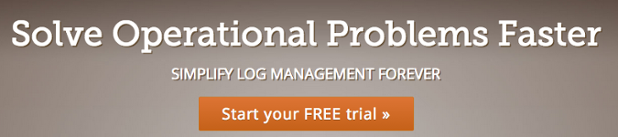
The headline is “Solve Operational Problems Faster”
The subheadline is “Simplify Log Management Forever”
The call-to-action is “Start your FREE trial >>”
On the surface every thing looks fine. But from a pure marketing perspective this headline leaves a lot to be desired.
Here’s the process you use to re-write this headline.
1. List out the benefits your service offers.
2. Write out at least 5 to 10 variations of your headline… FOR EACH BENEFIT.
3. List them out on a single document.
> Show them around. Several of them will stand out as being more compelling or attention-getting <
Here’s an example of a headline re-write. (I’m not going to write 50 headlines here. That’s what happens when you hire us 🙂 )
“This unique process solves operational problems up to 8,000% faster”
There are two specific PROVEN techniques in that headline alone that make it work better.
When you have a chance to write headlines use this process. When you have a chance to write your email subject lines… use the same process.
2: This simple mistake is one of the most common we see
As we move around the site, learning more and behaving like a typical rushed, distracted, busy prospect, we notice there aren’t many places to leave an email address behind to learn more. This feature is for those people who aren’t at the ‘Free Trial’ step and are one back click away from the ‘never to be seen again’ category.
We find one place to leave an email address: on the /blog page. You’ll see it in the top left of the page.
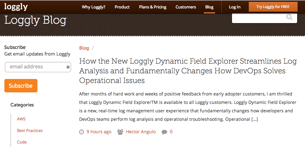
That’s a good location for the form but there are two things that could be done to improve.
One. (this is the big one referred to above). The big mistake that many companies make is to not have an email signup form on every page on the site. That means blog pages and all informational and marketing pages.
You’ll also benefit from having a dedicated signup page that you place in your Navigation Bar. A Sign Up for Tips nav button. This is commonly called a landing page and by having one you can also post links and call-to-action buttons throughout the site to drive more people to your sign up form. Which brings us to part two.
Two. Tell people WHY they should sign up. “Get email updates from Loggly” is not enough. You need to specifically say what a visitor will get when they sign up. Make it juicy and appealing and you’ll get more people joining your list.
3: How does the email unfold when I sign up?
One thing loggly.com does great. They use a custom Thank You Page. You can see it here.
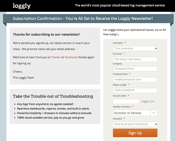
This is a very well-done Thank You Page. There is a message to tell the subscriber what to do. It lands you on the site and not some generic software page. It also puts the big secondary call-to-action right in your face. Sign Up for a Free Trial.
Good work here.
4: Great design is great. This is great.
I also have to show your their newsletter. The first one showed in my inbox within 60 seconds. Make sure your sign up form creates some email action right away. Send a Welcome Message (my favorite) right away. In this case I got the real newsletter.
That’s fine.
What’s GREAT about this newsletter is the layout. It is one of the best out there. Here it is and then I’ll explain why.
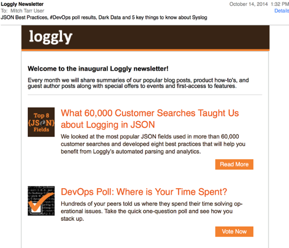
There is almost everything right about this email newsletter.
- The banner is small and doesn’t get in the way of the copy.
- There is intro copy to tell you what to expect in the issues (throw in a benefit to make it perfect).
- The images are small and support the story.
- There are headlines for each story.
- There is a teaser for each story.
- There is a clear call-to-action on EACH story.
The list of good stuff goes on. If you do just these basic things your emails effectiveness will go way up. Resist the temptation to add more buttons, images, copy, columns, lines, colors, etc. KEEP IT SIMPLE.
CONCLUSION:
It’s great to see a company incorporate some best practices right out of the gate. That’s rare. The challenge is you don’t know what you don’t know. You don’t know the specific techniques professional copywriters use to make great copy and you don’t know which strategies are proven to work (from thorough testing) and which just look good to you.
Up your game.