I thought it would help to show you what SPAM looks like in your inbox. If you’re following any of these email marketing practices, your message could be perceived as SPAM, even if its not.
I got this gem in my inbox yesterday.
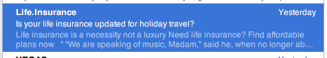
The from address is Life.Insurance. Since it’s not someone I know, or a company I know, right away I smell a rat.
Then the subject line confuses me. Life insurance for holiday travel? I don’t know how the two are connected… but perhaps I’m missing something.
Make sure your subject lines makes sense!
Next, my preview pane helps me out. The first two sentences tell me loud and clear I”m looking at a SPAM message. Non-sensical sentences. Ah, if only marketing were so easy, just say any words and people flock to your cash register!
Since I can’t help myself, here’s the message body.
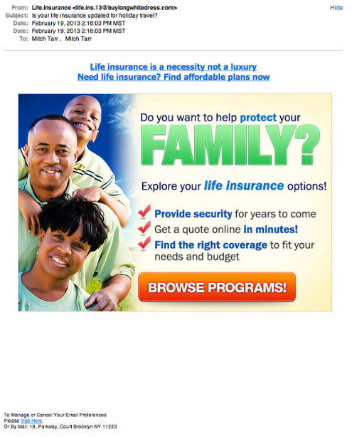
First thing you’ll see at the top is the From email address. You’ll notice it has nothing to do with the subject line and isn’t from a real person. My spider senses tell me don’t bother with this.
When you’re creating your email campaigns your From name and email address are one way to try and establish trust. This plays a big part on whether or not your email gets opened.
Then you’ll notice the ‘pitch’ is one image with copy and a call to action button. It’s got a headline, good. It’s got bullet points, also good. It’s got a clear call to action, very good. But one image is a problem. Blockers try to block it, spam filters try to filter it, so it has a hard time being seen as well as it could be.
Generally I try to create an email which looks more like one person sent it to another person. The never-out-of-style personal approach. Use it so your email copy doesn’t look like this.
Now I click on the BROWSE PROGRAMS button to see where we go. Naturally it redirects to another URL that’s not seen. Another bad practice. If you have to hide where you’re sending your readers, you’re likely up to something. You can use a custom URL, but think of this as another place where transparency engenders trust.
Finally you might notice there is a big gap between the image and the unsubscribe link. A little trick to not let the recipient off easy. Perhaps this will display under the fold and they won’t click on the unsubscribe button. If you can’t see it perhaps you won’t do it. Another bad practice. Make it easy for your readers to unsubscribe and don’t force their hand by sending non-relevant or spammy messages.
There. That’s my rant for today. Read our report. It’s got some other solid tips in it.