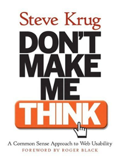
Many years ago, when I first got interested in online and Internet marketing, I came across a book called “Don’t Make Me Think!” by Steve Krug. Hard to believe this book is now 14 years old and on it’s second edition.
 Two things have stuck with me from this book. One, common sense it the operative phrase. Much web design suffers from upper management getting involved and driving requirements that make a website hard to navigate, read, use, and get what visitors need from it.
Two. Most assumptions people have about web design are dead wrong and usability testing will open your eyes as to how your visitors will REALLY use your site.
Email design is grossly misunderstood also!
One of the questions I get asked most often by prospective customers is to “Show me an example of your emails designs” so they can feel comfortable that we can make pretty emails. Of course we send them, but I think many people are missing the point of email design that works.
Here’s a few email design pointers that make the most effective emails. By that I mean, emails that get the best results.
Email design that gets the best results are simple.
The first thing you have to understand about email is that they have to be EASY to figure out what they are about and if they offer some value to the reader. There is NO room here for confusing design or giant headers.
In practical terms, make sure your email is a single column. It’s easier for a reader to go from top to bottom. Or make sure your email looks exactly like it would if it came from your desktop… a personal message. Those get read.
Let the copy do it’s job.
The most powerful design element in an email is the copy. Effective email design let’s the copy stand out and connect with the reader. Keep in mind, you’re only one click away from the delete button and pretty emails get deleted all the time.
Remove clutter.
You might not think of it as clutter, you might think of it as “I have to show my Facebook, Twitter, LinkedIn, Pinterest, Youtube buttons or…” Or what? On some emails you can find these buttons tastefully displayed in the footer of the email. In others they are predominately displayed in the header or in the right column (see above design point).
However, I’ve also seen top Social Media expert’s email messages with no buttons displayed at all! What does that say? It says you can keep the design simple by keeping it clean. Extra stuff can be a distraction.
Use images sparingly.
Sure a picture can say a thousand words, unless it’s the wrong picture!
Limit your use of images and use an image only if it clearly reinforces the point the copy is trying to make. Often an image doesn’t make the copy more clear. That’s a problem.
The real test of a common sense email design is to see if the email works when the images are blocked from view. You can use text in your Image Alt tags to minimize this problem but if your email can’t be understood when the images are blocked, you are missing out.
Control your line length.
More and more email is being read on a wider variety of devices. Years ago we didn’t have to worry about how the message looked on an iPad or iPhone, they didn’t exist!
However, if you create a message heavy in design, that doesn’t display well on a mobile device, you lose your readers. They don’t rush back to the office to see your message on a big screen, they hit the delete button and move on. Almost all emails received are discretionary. They aren’t life altering.
Keep this in mind when you’re creating the look for your message. Short line length helps to move the reader along the message. Don’t have any paragraph with more than 3 lines in it. Think light.
There are many more design tips to keep your messages easy to read and act on; these are just a few. And in fact making a simple, clean, effective design is HARDER that something big, heavy, and unworkable.
Don’t make me think to read your email. Lay out the copy so it’s easy to read, understand, and act.