I’m so envious. Somewhere, in some city, in some office, there is a marketing agency, or a marketing person, or a staff member who created the idea for the Ice Bucket Challenge.
And in so doing, they created what every marketer dreams of. A bona fide, grand slam, viral marketing campaign… one that includes celebrities, rock stars, sports stars, key business leaders, government leaders and the rest of us.
In other words… an iconic campaign.
The results are staggering. Last year the ALS Association generated somewhere in the range of $2.4M in donations. So far this year, north of $72M. Amazing. (Don’t quote me on these numbers – I snagged them from the Internet so they might be a bit off but the point is the same).
This single winning campaign has now freed the ALS association from EVER having to worry about cash flow again.
The reason? They have in one move built an email list that is the envy of every charitable organization in the world.
Here’s why.
They now have two massive resources they didn’t have before.
1. A giant list of new donators.
2. A giant list of new newsletter subscribers.
Let’s review their public email signup processes and make a few suggestions.
You know me. First thing I do is a Google search for “ALS challenge”
I find their site of course. That’s what I’m interested in. Where do I find their newsletter signup? Top of the page. On the right. It’s very visible and in a great location. Grade: A

That’s great. And kinda rare. Often the newsletter signup is hidden somewhere at the bottom of a page. This is a screen shot from the home page. Something else I notice. The signup for our newsletter form is on every single page of the website! Again, that’s rare to find. Grade: A
One small improvement to this great process might be to add a sentence under the form telling people WHY they should sign up. It’s small things like this that add up to a better overall result.
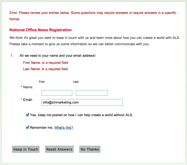
I fill in my email address and what do I see? This page.
Critical Error!
Holy bad programming choice Batman! I get an error message… really? This screen is like a cold bucket of water poured on my head. I take a sharp, short breath of air. What? I did something wrong?
No, I did not.
I am given an error message and told that First Name and Last Name are a required field. This is just such bad language.
My recommendation. Don’t ask for name at all. If you want this data then make the sign up process smooth, familiar, and easy. Don’t start our relationship by giving me an error message for something that’s not my fault!
A better process would be to ask for First Name and Email Address on the signup form and then consider this as the THANK YOU page where you are directed right after signup.
Get this right and get even more donations.
On this THANK YOU page you need to do three things to get it right.
1. Confirm to the subscriber they did it right. “SUCCESS: you’re on the newsletter list” would be a nice way to start out.
2. Tell them what to do next. “Check your inbox for your first issue.” “Read more >>” “See our story” “Watch celebrity Ice Bucket Challengers” would all be good things to tell me.
3. Ask them for a donation. Make a simple request and direct them to the donations page. It is possible that 10% or more of newsletter subscribers will take that step right there.
This is a great way to leverage all this new traffic generated by said amazing Ice Bucket Challenge campaign. I’ll just say it’s a pretty tough act to follow.
When I do fill in the form and click on the “KEEP IN TOUCH” button I’m delivered back to the home page of the site. At that point it’s now up to me to decide what to do. Having the attention span of a fruit fly, odds are I will move on to something else just as easily as read more on the site. My recommendation. Tell them where to go next.
30 minutes later…
I’m checking my inbox and nothing.
This is their first chance to make a first impression and a WELCOME EMAIL is a must. Not tomorrow but right now while it’s fresh in my mind. Let’s get the relationship started. A newsletter sometime in the next month just doesn’t cut it.
Summary
I was very impressed with the early use of email. Then the wheels fell off. Make these three changes.
1. Change the signup process to be subscriber-friendly and get more subscribers.
2. Use a proper THANK YOU page and start a stronger relationship.
3. Ask for donations on the THANK YOU page and increase contributions.
4. Use a WELCOME MESSAGE and earn my trust.
Everyone’s a critic! It’s hard to fault a campaign as iconic as this one but just what if these simple email changes give you a lift of 10% on your email signups and a bump in donations?
Learn how to do these things yourself. We built a great email marketing course teaching these very tactics.

