I’ve already written about an interesting email promotion from TaylorMade Golf and now I want to point out the role a good confirmation email can play as part of a great email campaign.
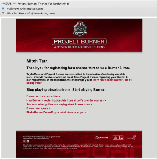
I registered for Project Burner to win a Burner 6-iron. Shortly after I filled out the sign up form I received this email. There are a few good practices in here.

Three pointers from the TaylorMade confirmation email.
1. Clean layout. The header in this email might be a wee bit larger than I would do but the layout, graphics, font selection and copy are very clean. This makes the email very readable. It must have been tempting for the designer to add images or a wallpaper or more, but someone said “Keep it clean” I applaud them for it.
2. What to expect. The first paragraph tells me what’s what. A thank you followed by an expectation that I receive a follow-up email. Good practice.
3. Good call-to-action. I like the selection of links for the call to action. It let’s me make a choice as to what I might be interested in. That makes it helpful.
But I really think there is a sinister marketing motive behind the call-to-action. Could there be some useful stats in store for the TaylorMade marketing team when they run their email statistics and see the number of clicks on each link.
Of course being a realist I can’t help but wonder what caused my mail server to flag this message as ***SPAM*** but something caught it’s attention.
Look for this and 18 other possible email marketing errors here.
