If you don’t read the Motley Fool financial website you’re missing out. Not that I’m a financial wizard or anything but they exemplify good content writing which is used to drive a big list.
 Here’s what I mean:
The creation of great content that people read, combined with an opportunity to get more information by joining a list is a common practice for online marketers. What’s not common is bloggers and companies doing it well.
I’ll walk you through the Motley Fool process on a mobile phone so you can see the process and their mobile opt-in design (which is fantastic!)
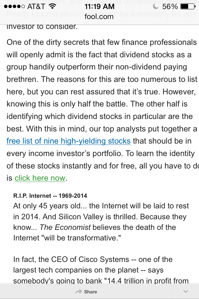
So, I’m reading a Motley Fool article. Here is a screen cap from my phone.

You don’t have to read the article to see what I see. Just make a note that the content is easy to ready and you’ll see a link to a free list of nine high yielding stocks in the copy. That link is followed by a call-to-action that is pretty compelling.
“To learn the identity of these stocks, instantly and for free, all you have to do is click here now.”
I know some of you have clicked on these pseudo-links (that’s how good they are) but I don’t want you to get distracted.
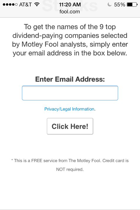
Here’s where they take you. (keeping in mind I’m on my phone)

I’ve often told you about the difference between the copy I see most often… “Free Newsletter” and this offer. This one has a headline, a logo, the benefit and a clear call-to-action. Look at the design. Is it fancy? No. Is it hard to read? No. It’s perfectly designed for mobile.
And what do they ask you to do? Fill in the least amount of information possible. See.

Essentially you are looking a great mobile opt-in design in action. They even use a button other than the “Submit” button. You couldn’t find a better example if you tried.
Keep this in mind when you’re planning your mobile offers. You have to make these changes to maximize your return on email marketing. More people are getting in on the game and it’s getting harder to stand out.
