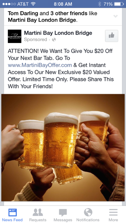
I think one of the best ways to demonstrate good email marketing practices is to show them in real life. Here’s an example of a local promotion for new customer acquisition.

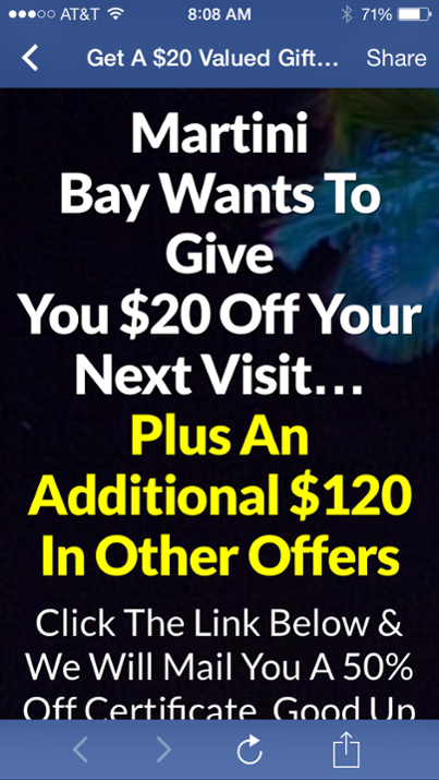
You can see from the copy the offer is pretty good. Since I was interested in “$20 off my next bar tab” I had to click on the link and see more. This is the landing page I am directed to.


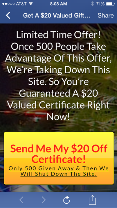
You can see the call to action button is very well displayed and for a touch of good measure they tell you there is a limited quantity and an impending event (the site will be shut down).
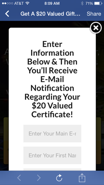
What happens next? I’m interested. This is a good offer and an example of a good landing page. Here’s the payoff – a request for your email address!

Let’s review:
1. The offer is presented in my Facebook newsfeed. Good targeting.
2. The landing page tells you what to expect, why it’s happening, and what to do.
3. There is a good and visible call to action.
4. The request for email address reminds you what you’re going to get.
Since more and more of the world is going mobile, you’ll be seeing more of these signup processes. Good email marketing doesn’t depend on a specific form factor. Good email marketing works when done properly.
