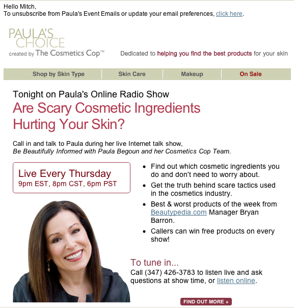
I have to say, I”m not really Paula’s prime demographic but I’m on her list and I look forward to receiving her emails. Simply because they are done right.
I’ll show you why in this email review. ***I’ll be reviewing this email design from a marketing perspective rather than a pure design perspective, just so you know***

Here’s why this is a great email design.
1. Personalization. Right off the top, an effort is made to connect with me. Always a plus. It’s a bit overused but human nature doesn’t change much.
2. The header is small, clean and includes the USP. Top marks. Most people are inclined to put a big bold graphic here. That’s a waste if the image doesn’t display in a reader’s preview pane.
3. The nav bar from the site is on the top. Testing has shown that this nav bar can increase clickthrough rates. Especially if simple like this one.
4. Good and prominent headline. Good copy works and good headlines are fundamental to good copy.
5. The bullet points rock. These bullet points tell me why to attend AND offer the ethical bribe–free products on every show!
6. Clear call to action. Simple, effective, in the right location plus a find out more button. Most people miss this critical marketing basic, especially in email.
7. They’re Personal. In addition to the Dear Mitch personalization the photo makes the email even more personal. Great use of the right image and a brand.
So if you’re thinking of asking for a fancy email newsletter design from a designer, show them this. You’ll get better results.
