I’m a big fan of Sheryl Crow so I couldn’t help but rate her email marketing practices when I passed through her website this weekend.
I think they take building their list seriously because there is a prominent link to the ‘Join The Official Mailing List’ on the home page.

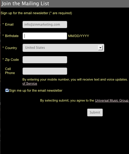
It’s above the fold and stands out. From a design perspective, I’m a big fan of putting the sign up form right on the page itself, but take a look at her signup form to see what they’ve done.

First, they did something smart. Four of the fields are required but one of them (the cell phone number) is not. I think that shows respect for the subscriber and should minimize people not signing up because they don’t want to receive (and pay for) text messages.
By asking for birthday and zip code I can see some very targeted messages in my future. Will Ms. Crow send me a birthday greeting? Will I get a message when she performs near my registered zip?
I like these features because it shows good practice of collecting information that can allow for a more personal connection. Now I know she isn’t going to send me a personal message, but when I get a birthday greeting I can’t help but read it and feel good.
How personal are your email messages?
